Monday 28 November 2011

EVALUATION


This is my recorded evaluation of my work. Incase the video doesn't work, here it is in written form as well:

In what ways does your media product use, develop or challenge forms and conventions of real media products?
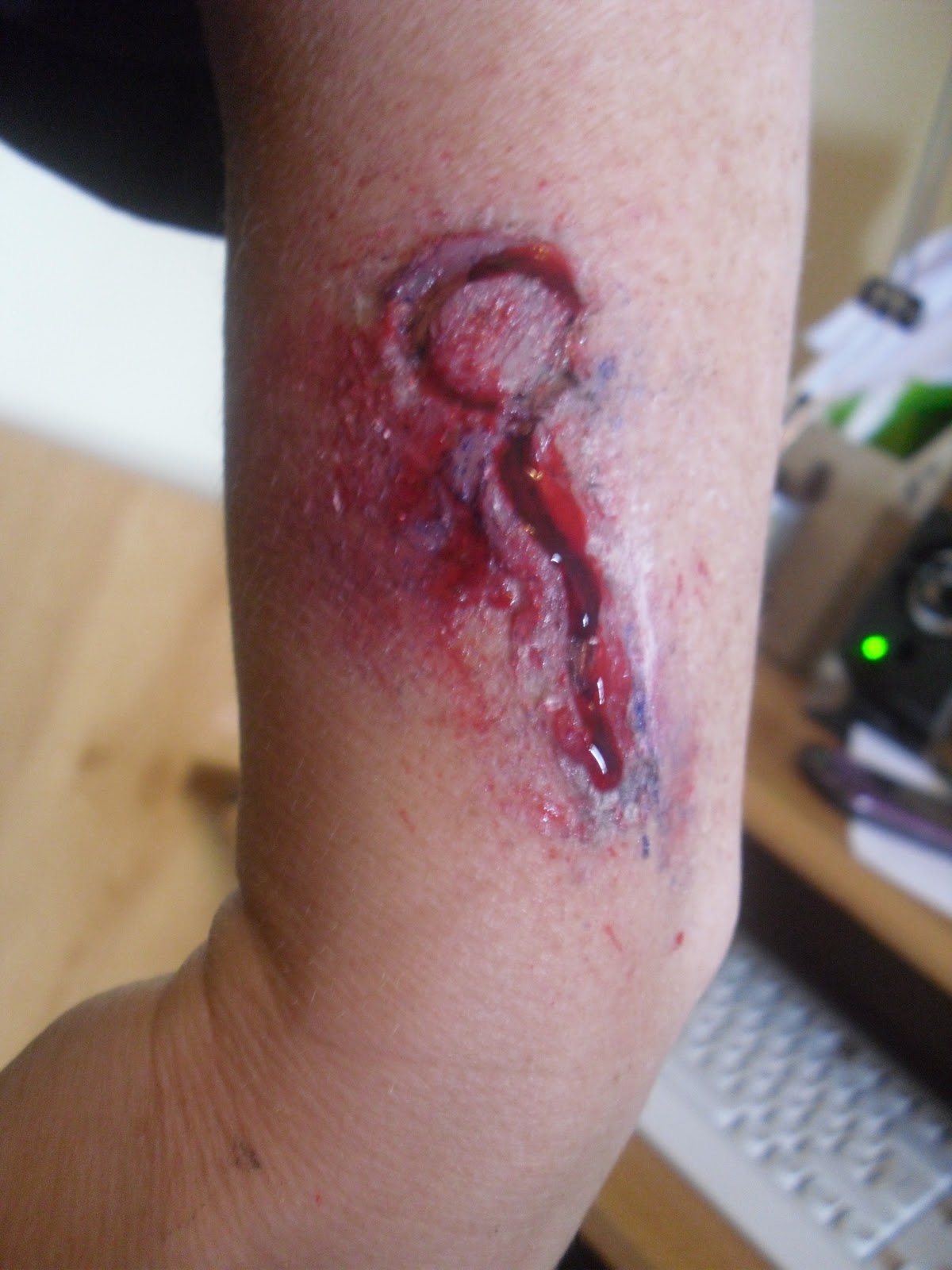
After looking into a number of different existing products including well know trailers such as Final Destination, The Blair Witch Project and Saw and linking examples of synergy, this gave me inspiration and ideas on the type of music, camera angles and makeup that I wanted to use. I wanted something that would draw in an audience and make them want to see my film and therefore I was aware that it had to be fast-paced and the camera angles that I chose predominantly set the mood for my trailer. I used low angled shots to create a chilling mood to show that the clown, who in this case was the villain, was the dominant person who was in control. Because the trailers are quite short, it is very difficult to convey everything that you want to in such a short period of time and to get across the jist of the story. I’m extremely happy with the accuracy of my teaser trailer and this has been confirmed by the people that I have shown it to. The music used as the backing track is what I feel makes the teaser trailer memorable as it gives a feeling of tension as well as giving it a supernatural mood. The stills that I used for the ancillary tasks of creating a magazine cover and poster are in my opinion very authentic. I spent quite a few hours researching magazines and covers used in existing horror films and trailers over the years and realised that dark, moody colours and close up shots of the main character are very effective, as well as the types of text and layouts.
How effective is the combination of your main product and ancillary texts?
Through the use of designing and producing ancillary tasks as well as the final media product, it helped me to focus on the real significance of synergy and construct it how I believed would be effective for my target audience. I was able to create promotions for my media product using a poster and film magazine cover and me having an strong interest in the horror genre meant that I had seen and studied lots of horror film covers and posters and watched horror films and trailers, so from the beginning I knew what I was looking at and what I and people of my age would enjoy. Throughout my variety of products created during the coursework task I have had an ongoing theme of the colours black, white, red and orange which adds to the consistency of my work and linking it all together tidily. I focused on the main character being constant throughout the products and giving off a creepy, daunting feel which I wanted to advertise through the use of these ancillary tasks. I had to make sure that they all would appeal to the target audience and that’s where my research of existing products came in useful. When designing my ancillary tasks I focused on the idea and simple-ness of film covers and posters such as films like Saw and Scream. Although they are quite plain and don’t have much going on, it is still a strong image connoting a storyline behind it which makes it more mysterious and tempting – drawing the audience in to purchase my product.

What did you learn from your audience feedback?
Having audience feedback in terms of work in general is crucial because to make sure that a product is appealing to a specific target audience you need to give them what they want. From using different research methodologies such as interviewing and questionnaire techniques, I was able to find out beforehand what my target audience would benefit from and their opinions on my work once it had all been finalised. I interviewed my mum at one point to find out her opinions on horror films and sent out questionnaires focusing on different aspects of the horror genre and incorporated their responses into my work; for example, what they look for in a horror film, what they enjoy and what they don’t. It was important to get the questionnaire and my research out to a wide variety of different sex and ages to be able to come up with a more realistic view-point. I didn’t get any constructive criticism on my work, but I was given some ideas on how to improve my work for example I was going to do the film in black and white, but after some feedback I decided that in this instance using colour as well as black and white was more effective. Everyone has their own opinions and different tastes on different things. However this feedback has helped me to create a stronger piece of work all-round.

How did you use new media technologies in the construction and research, planning and evaluation stages?
I think we are very lucky today because of all of the new technologies such as computer software programmes and special effects as well as hi-tech cameras when it comes to being able to research, plan and develop our work. If I had been asked to produce this media trailer and ancillary tasks years ago I don’t think that it would have been half as effective because I would have had to take a photograph, take it to the shop to be developed and hope that it would come out! Today I can take hundreds of shots and easily upload them onto a computer and proceed to use my software products such as Photoshop and Windows Movie Maker to alter and improve the image. The same could be said for a film that I would take on my video recorder, which I can now upload and using Movie Maker I can cut and paste and edit effects so that it appears more professional and realistic. When it comes to planning the fact that there is so much on the internet to research makes it so much easier than for example going to the Library. I can go from one place to another within seconds finding all sorts of ideas and existing products in the media. When it came to evaluating my work I was able to use the internet to send my work to other people for advice such as my teacher rather than waiting until the next time I saw her which saved time. She was able to advise me and told me that I should evaluate my work by presenting my data in graph form. Here again media technology such as Microsoft Excel came in handy as it was able to produce pie charts and bar charts on the information that I entered onto the spreadsheet by just a click of a button.

Friday 25 November 2011

**MY FINAL HORROR TEASER TRAILER**

Magazine Cover: Step Six/Final Cover


Seeing as there was information about the month's top top 10 films, I thought that it would be good to include a feature reviewing a film, I chose Final Destination as this is a popular film and most people have at least heard of the horror film series. I put this in yellow to stand out as yellow is quite a bright colour. I also chose the horror film 'Jennifer's Body' and wrote on the cover that there was an interview inside with the main character of the film Megan Fox. Megan Fox is quite popular with the male audience as she is attractive and this would also draw in the other audience as they may want to read about it because of what she looks like. I also included a competition advertising the prize of the replica of the puppet in the horror film 'Saw'. Saw fanatics may read this magazine and this could entice them to buy the product!

Magazine Cover: Step Five


This was then followed by some text added around the sides about what is featured inside the magazine. I chose the colours orange, red, white and green just to make it a bit more colourful. I added some information that there was a Johnny Depp Poster Inside - he is seen as a sex symbol for women and a vey popular actor in many films, so I thought that using him as celebrity enticement would make my magazine popular and successful. Fans of Johnny Depp would then look at the magazine and want to buy it because the poster is available inside. I also added on the left hand side a countdown of this months 'TOP 10 FILMS' which would engage with the audience because people will want to know what the newest film releases are.

Tuesday 22 November 2011

Magazine Cover: Step Four


I then inserted some text underneath the 'HALLOWEEN 2012', this piece of text lets the audience know about the upcoming Oscar nominees and a couple of names to draw the audience in. Once they see this they will want to know which other actors and actresses are going to be announced inside the magazine, enticing people to purchase the product. I also inserted a bar code from Google and put it on the left hand side and rotated it round to sit nicely under the title.

Magazine Cover: Step Three


Next I inserted some text reading 'New Release For HALLOWEEN 2012', in the 'Chiller' font which I believe is very gothic and looks as though it has been hand written by someone. The colour of this text I put in a mix of orange and yellow - much like the colours in a flame. Flames connote destruction and danger which is why I chose this colour theme. The second part of the sentence is designed bigger than the 'New Release For' because the information about when it is released is the key important factor.

Magazine Cover: Step Two


The next step that I took was the title of the magazine. After brainstorming I chose the name 'FILM FX', the FX stands for the word 'effects' because of all the effects included in my film. When designing the font for the title I settled on the colour theme black and orange - as it links with the colours on the clown. The font that I chose was Arial Black as this is a bold font which is very eye-catching when made large. I added an orange glow around the words and made the inside fill black to fit in with the background. The glow draws the audience in as it looks like fire connoting danger. I also added in very small white font the issue date and price.

Magazine Cover: Step One


Now that I have decided on my final picture for my magazine cover I can begin the editing. I opened up a Word Document and inserted the picture over the whole page. I thought that I would begin with some advertising text at the top of the page, so I inserted a text box and in 'Impact' typed 'WIN TICKETS FOR PARANORMAL ACTIVITY 4 PREMIER' in quite small font. The white is visible over the top of the black background and suggests the innocence over the evil.

Monday 21 November 2011

Ansillary Task: Designing Magazine Cover

The next step that I need to undergo is the design and creating of my film magazine cover. I will need to choose a final image out of my photographs from my photoshoot and think of a magazine title. Not only this but I will need to focus on my horror theme and create relating storylines and magazine features (that would be inside the magazine) on the cover! I will need to stick to a colour scheme and make sure things relate to eachother and compliment eachother.

Film Poster: Step Seven/Completed Poster


For the final step I chose to use the tagline, 'You don't face this fear.. It faces you'. I also put this is white to contrast with the black background as it also looks as though it's just floating, making it more mysterious. I positioned the first line just underneath the clown and then the next line quite a bit larger underneath that line. This way IT FACES YOU seems a bit more daunting and emphasized which is the effect I wanted to create for the audience of the poster. I felt that this really topped off my poster. I then realised that my poster wasn't completely evenly black around the edges. Therefore I re-opened this poster onto Photshopped and darkened the black around the blurred edges to sort this out.

Film Poster: Step Six


I then added the date of release in the middle of these symbols and underneath the text. Having it here and changing the font colour to red makes it more visible as it stands out because it is different to all of the surrounding colours. I also made the text bold to also help emphasize it. It also matches with the title which you are also drawn to. All the poster needs now is a tag line!!

Film Poster: Step Five


After this was completed I googled different company production symbols and pasted them onto my poster. I made sure they were white to stand out against the dark black background. These were just used to make the poster more professional looking as this is a feature of existing posters. I want it to look as real as possible.

Film Poster: Step Four


The next step that I took was adding the textual information at the bottom. I chose the font 'Onyx' as I thought it looked very similar to the professional font used for the text at the bottom. I thought that the text was very thin and needed to be inserted very small to look realistic. I wrote out the list of names such as names of producers and the special effects company and wrote the names in capital letters. I changed this font to white to make it show up better against the black background. I then inserted a website www.laughafterdeath.com to make the poster seem a bit more practical. This textual information was positioned near the bottom centre of the page but not right at the bottom!!

Film Poster: Step Three


Step four was adding the film title 'LAUGH AFTER DEATH' to the poster. I went onto the website www.dafont.com and thoroughly looked through their selection of gothic/horror fonts. I chose this font as for me it resembled writing that looks as though it has been written in blood - because of the dripping effect and use of thin and thick lines. The font on the website was plain white with a black outline, so I opened it up onto Paint and filled in the background black and the font bright red. Red to indicate blood and death, with the black representing darkness and unknown. I then inserted this onto my poster and positioned it in the left hand corner.

Film Poster: Step Two


After deciding which one of the photographs was my favourite and choosing which one which I thought would apply best to a film poster, I opened it up onto Photoshop. I adjusted the colour, brightness and contrast to make the colours of the clown bright and in focus. This was followed by darkening around the picture in black to give off a mysterious, strange, creepy effect. I edited the eyeballs so that they were just white so that no pupil could be seen – something that looks quite daunting as it gives the impression they are possessed. This was the second step.

Film Poster: Step One

Step One was searching through and analysing a selection of my favourite images. Some of my images were blurred therefore these were deleted, along with the photographs that I thought didn't really work well or didn't compliment my film very well. Here is my analysis of my three favourite images:


Out of the 30 images that I took on my photo-shoot, this is one of my favourite shots. I darkened the edges to give it a strange feel as though the clown has just come out of no where which makes it quite ghastly. I have also adjusted the colour so that it is not completely black and white but has a hint of colour but a darkness to it. I have also darkened out the eyes to make it seem anonymous – this is difficult for anyone to see the real identity of the stalker clown.

I like the facial expression of my model, she looks as though she is in pain and screaming for help but struggling to call out as the clown has more control. This makes the audience pity the girl and be frightened of the clown. The camera angle also adds to the vulnerability of the girl and the strength of the clown because it is quite a high angled shot however tilted slightly. The glove is quite bright as this is quite a large focus of the image as it is the thing that is holding down the model.
  
If I was to re-take this photograph I would make sure that the glove was a little bit cleaner. I really like this photograph though; I think that there is enough space to position text around it, making it a possible image for a magazine cover.


This is another favourite of mine, the feature that I like best is the blood splatter over the white door and the face of the clown. The red on the door suggests the innocence (white door) being ruined by the red blood. This effect was added on the website http://www.picnik.com/.

I also like the brightness of the colours on the clown, I edited the saturation to make the colours illuminous and really stand out against the dark black background which contains the unknown. The low angled shot connotes the power and strength the clown has over everyone. It makes him more dominant than everything and more threatening from an audience’s perspective.

I have also edited the clowns eyeballs so that they are completely white, making it look like no one human is actually behind the mask making it all the more creepier. I also darkened the background with a black fill making it look as though the clown can  come from anywhere. You never know where he is hiding! This is a possible photograph for a magazine cover.


I like this photograph as everything around the main image of the clown coming into a door is clouded around it black. It is also a very clear shot, meaning that you can see all of the features of the clown, because the clown is facing forward looking at the camera you are able to fully see the mask. I think if this was what I saw trying to get into my front door I would be terrified therefore the positioning of the image is perfect!
 
I am very happy with this image as I think it looks professional because of the colours and contrast. There is also enough space around the image to insert text and titles to make it either a poster or a magazine cover and fits really well with the horror theme.
 
The reds and greens and yellow colours are all bright colourful exhilarating colours – the quality of clowns but the face is so horrific that it takes away this feel and puts a horror theme on it.


Ansillary Task: Designing Film Poster

For this Ansillary Task I am creating a film poster (I will also be making a magazine cover for a film magazine). Therefore once I had finished filming my trailer I organised a photoshoot with my models dressed up and took photograph's around the filming area. When taking these images I wanted to encorporate and give off hints to the storyline just by still images.

Feedback On My Completed Trailer

This is a copy of my feedback question sheet which I handed out to a couple of people. I asked my sister and my mum to ask a couple of their friends to watch it and to answer the questions, this way the answers wouldn't be bias if they knew I had created it.

All of the answers to the first question were a yes. Results found that some enjoyed the part where the clown was in the toys, the part at the door where some explained how it made them jump when the clown banged on the window! This part along with the ending with the girl screaming made everyone jump as they weren't expecting it. The music got a positive response as a couple of people stated that the music was very catchy and staid in their heads! While others described that it was very eerie and 'haunting'. Majority of people answering the questions explained that they would go and watch it if it was a real film, one reply was 'DEFINITELY!!!'. Some said that the storyline was clear while others said that it wasn't extremely clear but from the trailer could get a rough idea! All participants answering the questions said that there was enough varied video effects. The last question got a variety of responses, all positive! Someone put down that "to improve it.. you should make it longer!! Wanted to see more!".

Overall my results for this trailer was all round positive which I am very pleased about!

*Adding Film Name & Final Credits To My Trailer


This part wasn't too difficult, I inserted my title name onto a black screen with red font connoting death and blood. The text was very gothic with thin lines which made it look creepy. This was given an Ease In Effect as it was part of the end credits and emphasized for the audience. The next part was a black screen with the words 'COMING SOON'. This began reasonably small but comes more into focus as it Eases In. I didn't use a fancy font for this part as I wanted it to seem realistic and professional.

*Including The Kidnapping & Scream Shot

This was followed by a shot of the female being kidnapped, therefore it is a very quick shot of a white glove (which should be pressumed as the clown) grabbing the girls face. It is an extremely quick shot with a quick slide transition between that and the next shot. Once this was in my trailer I edited it so that as she was pulled back the shot rolled into the next one. This next one was of my model panting under the table in the dark with only a bit of light on her - hoping that she wont get caught. All of a sudden she gets pulled from behind and a piercing scream was entered at this point. Here I eased the music off as she screams so you cant hear it trailing away. As the title of the film then comes next the song begins again but only with the short creepy chimes as from the beginning which then trails off and becomes quieter as the film ends.

*Adding Wound Shot To My Trailer

This is a photograph of the wound that I created on my models arm. My storyline involved the clown carving a balloon shape into his victims skin to leave his mark at the crime scene. So using my wax, I created a balloon shape and filled the insides black to create depth. I then designed the bruising around it, using a rough sponge dabbing dark purple paint around the wound. This was finished off by painting red paint around the cut, and squirting thick gloopy fake blood into the slice to make it look realistic. To make the wound look fresh and glossy I used a glaze of washing up liquid on top.
I took a cork screw from my kitchen and got a helper to rest the screw into the pretend wound to make it look as though this was really slicing into the skin. I filmed this on my camera for two seconds and uploaded it to my Movie Maker Timeline. I fitted it into the section that I wanted, followed by adding a Fade In Effect along with a Film Age Effect which made it look very old. I used colour here to emphasize the blood and wound.

*Adding The Four Sharp Shots To My Trailer


These are my four quick shots of the clown, the first being him quickly poking around the door. The second is a shot of the stairs with the clown jumping round the side, with the third being a shot of a mirror closing and the clown standing there. The fourth and final shot was of the pitch black dark followed by a torch being switched on and the clowns face appearing. I added a fade in at before the shots happened and after the last one, with really fast transitions between, which I also fastened up with a 'Speed Up' effect. The idea of these camera shots was to captivate the audience and mesmerize them by making them watch closely. The fact that not every single shot is that of a dark, gloomy one suggests that the clown or a stalker in general can be following you at anytime, even in the day.

*Adding Three Shutter B&W Shots To My Trailer

This is one of my favourite sections of my horror trailer. I began these shots by dressing up my model and positioning her first in the corner of my garden standing still. Keeping in my same camera position, I filmed that for two seconds followed by the same sort of shot but in a closer position of the garden. I then filmed her really close to the camera. The look I was hoping to achieve was that if I placed these short clips together it would look as though she was getting closer without moving.

Once uploading these shots onto the computer and onto my Movie Timeline, I added a grey-scale effect to make it look old, along with a fuzzy 'Film Age, Older' which meant that the clips would have an old-fashioned camera filming effect. Here is a before and after shot of my editing.


*Adding Moving Text Into My Trailer

This here is a print screen of my Movie Maker Timeline. To create this moving text, I opened up a word document selected the 'Chiller' font, with a red glow around it. I entered the words 'YOU DON'T FACE THIS FEAR.. IT FACES YOU' against a black background. I also inserted a red balloon to match with the clown theme. Once this was all completed on this document I pasted it to a Paint file and cropped it and inserted onto my timeline. I then used the 'Ease In' effect; an effect used in real trailers. This way it looks as though the information is being thrusted at you, forcing you to read it although you are drawn to it automatically anyway.

This is the final outcome of one of  the pieces of moving text in my trailer. It looks creepy as though it has been written in blood.

*Adding Toy Shot & Door Shot To My Trailer


My toy shot was the next shot that I wanted to encorporate into my work. I dressed and positioned my model into a little cove in my bedroom where natural light was able to shine through, and surrounded her with toys to make the clown look part of it. I then filmed a quick shot worth two or three seconds of the eyes moving horizontally either side. This added a creepy effect as all of the other cuddly toys look innocent and still, whilst the clown is alive and moving. Once I had included this into my Movie Maker Timeline I added the Film Age Older effect and Ease In along with Fade In. Having the old effect makes it look as though it has been filmed on an old fashioned camera and still looks very scary! I then cropped this shot down to one/two seconds as I didn't want it to drag on, I wanted just a quick shot of this.

Once I had done this positioned my clown behind my front door - the glass in the front door is quite blurry so this gave the clown an anonymous look from this angle. I took a shot of my front door, this lasted quite a while as I wanted to build the tension up here. After a couple of seconds my model was cued to move her face into view in the window and bang on the glass with her hand - hopefully frightening the audience. I added an ease in effect here as I felt that when I zoomed in on the camera it didn't look as effective. I also didn't want to walk forward as this would ruin the mysterious effect as the camera would be all over the place! I also added an effect that made the colours change which I thought was interesting as well as attractive - lots of colours links to a clown.

*Adding Theme Music To My Trailer

I wanted something that was creepy but along the lines of clown/carnival themed. After searching on YouTube for about an hour I found the perfect piece of music that would fit the storyline! I want to use this in my film trailer as the backing. So I downloaded this from the internet and opened it into Windows Movie Maker and added it into the 'Audio' section on my Movie Timeline.


The beginning part of the song starts with slow chilling chimes that sounds like the noise a jack in the box makes/ that sound links to a clown. It’s very disturbing and then after the little chorus has played on its own, lots of noise builds in with it. The song fastens up and a beat is added to it – in the style of a heart beat. Low strings are then added to make it strange and heavy. The same little theme song high pitched is playing underneath. That little theme then changes instruments and pitch to give it some variety; meanwhile it starts to fasten up and builds up the pace. There is then a part where there are scratchy uneven sounds along with sounds of ghosts whining and moaning. The music is still eerie and gives off a sense of mysteriousness. It makes you feel as though you wouldn’t want to listen to that music in a house on your own as it makes the hairs on my spine stand up! The music then really builds up towards the end with lots of heavy instruments which get your heart racing. There are a lot of off-key sounds throughout which makes it scary and uneasy, which all results back to the beginning chimes to finish it off.

Sunday 20 November 2011

*Adding My Newspaper Shots To My Trailer

For my first couple of shots I wanted to use a newspaper article to create a realistic feel to my trailer. I designed a mock-up newspaper, with a headline reading, 'KILLER CLOWN STRIKES AGAIN' which I filmed using a panning effect. I then got a model and created a bullet wound to the head using my wax and special effects make-up (paint and fake blood) and positioned her on the floor in the hall asking her to keep her eyes opening and keep still, giving the effect of a dead body. I took a couple of pictures of my model from different angles and found the best one was in the crane shot in black and white to make her look like the vulnerable victim. I then printed this out, along with my paragraph on my mock-up newspaper of a brief description of the murder victim and how the clown killed her. I also took a picture beforehand of my model just smiling because I wanted to use the idea that is used on the news reports where they show a picture of the victim alive. I then printed all of these out. Using my camera again I filmed the alive picture and uploaded it to Windows Movie Maker and used the Film Old and Ease In effect to make it look grainy and in keeping with my opening shots. I then filmed the paragraph and switched the camera quickly to the shot of the model lying dead, which I added a Fade In and Fade Out To Black effect. These were my begining shots! 


*Adding Production Company Intro To My Trailer

Most trailers begin with the film production company name, so I decided to design and create my own. As I settled on the name 'MACABRE PRODUCTIONS', I opened up a Word Document and inserted a black text box and chose the font 'Chiller' for the text. I chose this because quite creepy and as though someone has written it with ink/blood - the sort of writing you'd see in horror films. I chose to design the colours contrasting from orange to red, as this represents blood and danger. The background was black to suggest mystery and the unknown. I also placed a reflection of the words underneath slightly to resemble a pool of blood.

I then cropped this and opened it up onto a document on 'Windows Movie Maker'. I also downloaded off of the internet a sound effect of a lightening bolt - which again created a horror, chilling effect. I placed both of these onto the movie time-line together and added the following effects: Film Age Old, Film Age Older, Ease In and Fade in from black. All of these effects combined created an old-fashioned but modern feel to the opening of my horror teaser trailer.


Finished Clown


Creating My Clown

I began my designing and creating by visiting different places to gather my resources. I went to Hobbycraft to purchase white clown makeup, as well as pallets of different coloured paint. I bought a variety of different sized sponges and paintbrushes to use. While I was in Hobbycraft I also picked up some pieces of card, some string and ribbon. I also found two white plain paintable masks which I then added to my collection! I also went to a joke shop and purchased some fake blood in case I needed to use this. On the way home I popped into Tesco's to buy some red balloons too! I also borrowed a clown hat from my neighbour.


When I returned home I used my dining room table for my painting and designing. In pencil I began by drawing onto a piece of card the ruffles that would usually be placed on a clown costume. I painted each section orange and red because I thought this was a creepy colour combination and scrunched up tissue paper into balls and glued them onto the card when it the paint had dried. I made holes in the corner of each and put a piece of string through - this would hold the ruffles onto the model's body.

After this I moved onto my clown mask. I began by painting on the arch evil eyebrows black and painted little wrinkles at the top. I then painted green triangles around the eye area and a bright red circle for the nose. This was followed by the mouth which I penciled in first to make sure I didnt make a mistake. I drew lots of sharp teeth (because this was a factor existing evil clowns have!) and filled the rest of the mouth in black to make it seem dark and mysterious. This was topped off with the red outline around the mouth - a clown feature.

The Look I'm Going For

I want my clown to look as scary as possible because it is a horror theme and the perpetrator needs to be as daunting and threatening as possible. Here are some idea's of the look I'm hoping to achieve:


Not only do all of these evil clowns seem to have the same features eg. red hair and red nose but what makes them evil are the eye make up. Sharp arches eyebrows give off an evil look, as well as dark triangles or rings painted on around the eye area. The mouths seem to also make a difference, an evil smile with lots of dirty, sharp or jagged uneven teeth. I am planning to encorporate these ideas into my design of my clown...

Thursday 17 November 2011

Film Name and Taglines

FILM TITLES:
When I was researching existing films and posters the idea that stuck in my head which I found was effective in terms of names of films and taglines, was a clever play on words with a horror twist on it. An example of this on the Final Destination posters was ‘REST IN PEACE’ – REST IN PIECES however even though this has already been used something along those lines would be a powerful idea. A possible idea that I came up with was, ‘Laugh after death’ – a play on the words ‘life after death’ which I thought worked because I am planning on using a creepy clown laugh right the way through the trailer. I also came up with the name ‘Dead by Dusk’ but I felt ‘Laugh after Death’ was more significant.

TAGLINES:
I needed to incorporate part of the storyline into the taglines, and some that I came up with are as followed:

“Fun is only painted” – linking to clown paint and torture
“You don’t face the fear, it faces you” – links to the idea of a stalker/can’t hide from them
“The laugh is just an illusion” – linking to the key creepy clown laugh

Designing My Production Company Name

After I had researching existing film trailers, I noticed that all of them open with a shot of the Production Company Name. An existing example of a famous horror film Production Company is 'Twisted Pictures' who are known for their 'Saw' films.

I explored on the internet production company names and tried to design with my own one, but I had no luck. I then used the Google search engine to try to find synonyms for the word ‘horror’ and different words but with similar meanings. I found the word ‘Macabre’ and found out what it meant; horrific and disturbing. I thought that this fit quite well into the theme of my film and ‘Macabre Productions’ had quite a ring to it!

Wednesday 16 November 2011

Up Until 2am.. A Fresh Idea

I then worked solidly for hours trying to put some ideas together. I wanted my film to involve a revenge storyline, so someone was doing something horrific through the idea of payback. I thought about brainstorming ideas for what my perpetrator could be; these are a few ideas that I came up with:

-       A kidnapper
-       A murderer
-       A torturer
-       A stalker

I then came up with things that would be quite creepy:

-       Masks
-       A clown
-       Someone burnt
-       Someone dead but alive
-       A monster
-       Aliens
-       The grim reaper/someone hooded
-        An animal – but made to look creepy

I thought that if I took the idea of a clown and a stalker and combined the ideas together, this could make room for lots of scary but inventive ideas! This is a basic outline of what I was hoping for (for a storyline):

Man becomes a killer stalker dressed as an evil clown and gets revenge on people that have crossed him and ruined his life. In this film he tracks down a woman, finds where she lives and taunts her before entering her house. He ties up his victims and calves into their skin an imprint of a balloon – something that relates to him so that when the police find the bodies they know it was the infamous clown killer.

Tuesday 15 November 2011

SCRAP THAT!!!!

With the coursework deadline looming, actors dropping out and storyline changed too much because of problems along the way; I thought that it would be a good idea for me and Harrison to scrap our idea and change it completely. I spoke to Harrison and explained that what we were aiming to do was too high-tech for us and I came up with a new plan. Here are the following ideas that I put forward to him…

Previously for filming we had to rely on quite a few actors (6-7 people) all to be able to make the same date at time and people were very busy, it was quite difficult. I said to Harrison that we needed a new plot that only involved a couple of people, perhaps three at the most as we could get it done easier. I also explained that we needed a secure location that wasn’t going too far in terms of health and safety (like previously!!).

Because of personal differences and different ideas, we both decided that from here we would work seperately because that way we wouldn't have to rely on eachother as much.

Wednesday 9 November 2011

'Nightmare On Elm Street' Film Poster Analysis


The main colours on this film poster are red, black and yellow; colours which represent fire. Fire can cause destruction and through the use of these primary colours, it connotes a sense of damage – something that links to the storyline of lives being ruined by a man in their dreams.
A black blurred border is located around the edges of the poster – this conjures up a sense of being trapped and the sides closing in on the characters, much like when you are falling asleep.
There is a contrast on the poster of light and dark; natural sun rays streaming through from the window trying to light up the dark room. This is binary opposition between evil trying to deteriorate the good. The positioning of the models also complements this argument; as the victim is closer to the audience whilst she is lower than the ‘evil’ approaching her from behind. The man is higher up than the woman, while she is sinking into the floor showing evil as more dominant and superior than good in this film. The text reading ‘he knows where you sleep’ adds to the fact that there is no escaping from this monster, he knows everything and will always be there. The faces have both been darkened so characteristics are not visible, however this connotes mysteriousness and we as the audience are then left to imagine ourselves what their facial expressions show.
All of the textual information on this film poster is positioned at the bottom centre of the page, leaving a lot of room for the central image to grab everyone’s attention the most. As the colour scheme is red, black and white, the text is written over the darkest part of the image in red and white font making it more conspicuous. The title of the film isn’t written clearly, some parts of the letters are fogged over denoting that not everything is simple and perfect and not everything is easily fixed.