The central image is what catches the audience’s eye first when it comes to magazines. The cover of this specific film magazine involves the three main characters from the well-known supernatural fantasy film saga ‘Twilight’. Kristen Stewart, Robert Pattinson, and Taylor Lautner are known world-wide and using these characters on the cover of a magazine is ideal as it will draw in a great number of the magazines target audience. The positioning of the characters on this cover displays the basis of the storyline - how the two men are both in love with the woman and how she feels trapped. This way the audience will feel that they are familiar and connected with the film, making it more appealing and want to read the magazine.
The magazine title for this cover really stands out against the mysterious, cold background. It not only links to the vampire story but has a bright glowing effect behind the characters making it still stand out even though the characters are the main focus. Again, the barcode is presented vertically, making sure no attention is taken away from the central image.
'FREE GIANT POSTERS' are also advertised on the cover of the magazine, which is written in a large font at the top of the page, not stealing the limelight away from the main image/story, but it's big enough to be noticed and have attention paid to.
As the audience of this magazine, the first thing that jumps out to me is that Daniel Craig is on the front cover. Daniel Craig - the new James Bond - is seen as a 'sex symbol' for some women, targeting the female audience automatically. The fact Daniel is looking into the camera gives a direct mode of address making the audience feel as though they are involved and connected with him. Furthermore they are lead to feel as though he is specifically targeting them in particular, making the magazine more tempting to purchase.
Not only is the title of the magazine behind the image of Daniel's head, but there appears to be a white glow around him; suggesting his importance and domination which adds to making him more of the focus of the magazine.
The colour scheme for this cover is that of a chilled, relaxing one - with colours such as blue, white and grey. Even the cover model's clothing matches the scheme, making it all appear very professional and presentable. Having large, bold red font at the top of the page reading 'HOLIDAY MOVIE PREVIEW' makes this piece of information really stand out against the cool, calming colours which is on the rest of the page.
The magazine issue number and price is written in a very small font, making this information less important because the price doesn't matter as this magazine is almost 'worth it'.
The magazine title is displayed in a large, bold font which as a reader you are drawn to quickly. The colour scheme for this film magazine cover is black, silver, white and red. The colour of the magazine title and the caption at the bottom of the page match the bright red evil eyes of the face. The colour red connotes maliciousness and danger, while the silver and black denote an icy, heartless, murky effect – which is in relation to the film ‘Terminator’ being promoted here.
The text at the top of this page reads, 'AMAZING FLASHING COVER PRESS HERE'. The fact that the eyes on the magazine will flash will automatically make the product more appealing to the audience as this is spontaneous and unordinary for a magazine cover to consist of. This feature will also help easily engage with the target audience and engross them further into purchasing the merchandise.
The main image on this cover is a close-up shot of the robot. The close-up angle displays the physical detail on the metal face while portraying the evilness of the character by the facial expression. The robot has the same facial characteristics of a skeleton skull which portrays the horror/creepy impression.
The barcode is positioned vertically on the right side of the cover; this is so that it doesn't steal the attention away from the main image. Aswell as this, the price of the magazine is written on the left hand side underneath the title - again preventing the attention being stolen - and making the reader so immersed in the image that paying £3.90 to purchase this magazine is agreeable. Having the date and issue number on the magazine can not only look professional but make new readers to this magazine aware that it is a well-known company.
With our model look complete, we took Joanne to the meadows and took some photographs focusing on location. In the following first set of pictures we focused on the lighting of the images, using the sun rays to outline her shadow and to add to the creepiness of the photographs. We also focused on the woods/green setting connoting that perhaps she is familiar with her surroundings, lurking in bushes and behind tree's waiting on her prey - much like the idea of an blood-thirsty animal.
The next group of photographs were shot by the river edge and by the bridge. We picked the perfect time in the evening to shoot this photoshoot as the sun was just going down, adding the creepy effect on the water making it look eery and gloomy. In the images where Joanne is lying down face down in the grass, her hair covers her face and the darkness surrounding the image connotes a sense of mystery and uneasiness. The idea of Joanne having wet hair made it not only look greasy, as if the girl was dirty and not human-like but makes her look as though she has been living in the river for a long while and adapting to her surroundings. The image of her lurking in between the grass makes it seem eerie also as that would not be something that anyone would like to come across whilst walking their dog in the fields. The close up camera shots were to capture the detail of the makeup and the facial expressions.
I think Joanne did a fantastic job improvising facial expressions and body language that she created when these photographs were being taken. This concludes with a very successful photoshoot, edging mine and Harrison towards this specific idea more.
Mine and Harrison's friend Joanne agreed to help us out and be our model for the Test Run Photoshoot. Joanne is a drama student and found that she was very good with improvising and portraying different expressions and body language in the photographs. We thought she was a fantastic model.
This was Joanne before the shoot:
The first steps to creating this shoot was Joanne's hair and makeup. We began with the Special Effects Makeup where we rolled up wax into a long sausage shape and pressed it onto Joanne's skin. This was going to be a pretend scar, which we positioned across her nose from one corner of her face to the other. Using a plastic spatula we worked the outside of the wax onto her skin to give it a raised effect. Following this, we run the spatula down the centre of the wax and opened it as if it was an open wound. We then used black, red and purple paint to create a blood, open glossy wound. We then added dabs of yellow to give it a puss effect. We then started sponging white face-paint all over her face, neck and arms, which was followed by dabbing black, purple and red paint together to create a bruise effect on her forehead. We added fake blood around Joanne's mouth as if to look as though she had been eating flesh/blood, and red and black paint under her eyes to make her look ill.
After back combing and adding a bit of water to Joanne's hair we dressed her in an old fashioned dress from a local Charity Shop and splattered it with fake blood. The look was now complete! Here is the final product:
After researching different types of horror films, I was able to then have a broader knowledge of other possible plots. The next step that I undertook was to brainstorm more ideas and after discussing it with Harrison we decided that the idea of a dead girl in a forest at night would be quite a good idea.
As I have been basing my A-Level Photography coursework on horror also, I had Special Effects make-up, costumes and fake blood left over. We thought that we would experiment these on a model whilst completing a Photoshoot for a test-run before we thought of specific details of our trailer.
For mine and Harrison's storyline, we were planning on basing the film in a derelict house. Therefore we visited one in Sidcup to have a look whether it would be suitable for our trailer or not. We visited the house in the evening once it had got dark. However there were noises coming from the house and it looked too dangerous so we decided it would be safer to not go any closer. The windows were smashed and curtains being blown from the wind, there were no lights, the grass was beyond over-grown and there were rats in nearby bushes. This would of been a perfect location for our type of trailer. Below is a picture of the house:
We both decided that maybe a derelict building wasn't the most suitable of ideas for a location for our trailer, so we thought that we should re-think our ideas and possible choose another storyline. However we still wanted to stick with the horror genre but just change to a different plot all together with a different location. We felt that we may be too out of our depth with this idea.
A few weekends later, we re-visited the house but during the day so it was safer and lighter. These were some pictures taken from outside the building:
The front door was already open, so we ventured inside the house being very careful. We found that it was in fact an unoccupied bungalow with a few pieces of ruined/old furniture scattered around. We took some photographs of the different rooms:
There were newspapers, glass, dirt, tools and broken furniture everywhere. After visiting the house Harrison and I came away thinking that it had no scary effect to the house, it just looked like a tip. It also was quite dangerous with the missing floorboards, smashed glass and bad smell. We then came to the conclusion that we should change our location for our trailer.
I wanted to find out how many different horror sub-genre's there are in the film industry, so I researched on Google and found my answer. I used the website Answers.com along with the Wikipedia website and the following image are the most specific types:
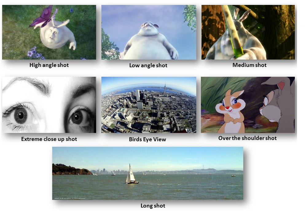
Here I have researched and demonstrated the main types of camera shots, most of which I am hoping to use in my media trailer, film cover and poster.
High angle shot: This shot is from above the subject, looking down on it to make it appear small and/or vunerable.
Low angle shot: This camera shot is from below the subject looking upwards at it, making it appear large and dominating.
Medium shot: This shot is also known as a mid-shot, and shows detail quite clearly but without getting to an uncomfortable closeness.
Extreme close up shot: This shot gets right up close to the subject, showing defined detail. There would normally need to be a proper reason for the camera to get this close.
Birds-eye view: A birds eye view is a shot in which the camera photographs a scene from directly overhead.
Over the shoulder shot: This shot is from behind a person looking at the subject, it is usually used when someone is either looking at something or in conversation with another person.
Long shot: This is usually used at the begining of a film to show where the story begins. It is of a wide scene.
Close-up shot: This shot shows a detailed view of a person or object.
Cut in shot: This shot involves cutting in to a specific part of the subject in detail.
Two shot: This shot involves two people in the same shot.
Point of view shot: Shows the view from the subjects perspective, showing the view at eye level.
Tilt shot: A tilt shot is a camera shot where the camera is at a slant so the piece of media is at an angle.
Wide angle shot: A shot which allow the camera to photograph a wider area than a normal lens would. The effect is to exaggerate perspective and are also used for deep-focus photography.
Harrison and I made our final decision on a horror genre for our teaser trailer because we felt that we had lots of possible ideas between us. My interest in the horror scene has amplified over the years as I have based my Photography Coursework on horror and fears and we both love horror films. My passion for horror and creativity has increased so much that after I have completed my A Levels I am planning to go to University to study Forensic Investigation to hopefully get a job as a Scenes of Crimes Officer. We also thought that it would be a fun and interesting challenge to see what we could successfully produce between us.
Here I have gathered my information from my questionnaire and analysed it by putting them into different graph forms. I have also written some information about my findings:
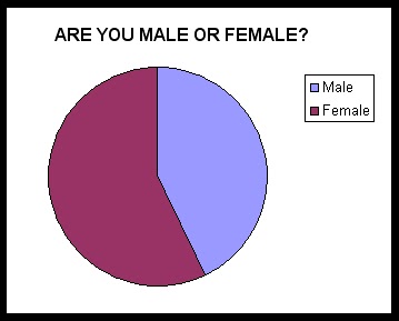
This was my beginning question, asking whether the participant was male or female. I handed this questionnaire out to seven people, three of those seven were male and four were female. This pie chart here shows the difference. Gender could affect whether horror films are popular or not with my specific participants.
This question was which age rang my participants fell into, 2 out of the 7 were between 12-15 years old, another 2 were over 40 years old and other 3 were between the ages of 16-18, 19-25 and 25-40. This is shown by my part chart.
This was my third question and asking my participants whether or not they like horror films. 4/7 said yes, whilst the other 3 said no.
This question asked how they watched horror films. This question they were able to tick more than one answer. One person prefers the cinema, 5 prefer on the TV, one person on the internet and DVD had three people. The reason for these answers could be determined by individual differences eg. someone may feel safer and more comfortable watching it on TV in their own home.
3 out of the 7 said that the majority of their friends don't watch horror films, whereas the other 4 said that their friends do.
My next question involved whether their first horror film that they ever watched scared them at the time. After looking at my results and analysing them for this question, all seven participants said that they were scared by their first horror film.
This bar chart reflects the results of my next question, I wanted to find out why don't people like being scared. 1 person chose the 'Nightmares' option, two people said because they get scared easily and they don't like being scared. No body said that they didn't like it because it made them look weak, and the mode was that they don't like the adrenaline when being scared.
My next question was asking them why they do like being scared, three people said that they don't. The other four said they do like the adrenaline rush, whilst no one chose the 'because it desensitizes me' option.
My next question asked why they watch horror films, three people said that because they don't get scared they enjoy them. This was the mode answer, whilst two people said that they like the gore. No body chose the 'because they make me laugh' or 'because of the suspense' options.
'Do you get nightmares from horror movies?' was my next question. One person chose yes, whilst five chose the 'no' option. One person said that they do occassionally. The mode answer was 'No'. My next question was whether they like horror movie sequals with four people saying yes and the other three saying no.
I then wanted to find out what the favourite main concept of a horror movie would be. The people taking part in the questionnaire were able to choose more than one answer. Three people chose gore, whilst six people like the Psychological aspect of horror films. Three people chose originality of films and no one chose suspense or scary music. This helped me when designing my film! The next question was whether having a final person as a lone survivor at the end gives a better effect, this was interesting three people said yes and four people said no so this was quite a tight one.
The final question was finding out what kind of antagonist is preferred in a horror movie. Three people chose zombies, two people chose vampires, two chose werewolves and no one chose aliens, mythological creatures, giant animals or bugs or children. Serial killers was quite popular along with the unknown for example paranormal activity. These results of the final question were a great help and really made me think when designing my own film and film storyline. I took this into account.
I wanted to find out how the majority of people felt about horror films, so to help with my research and planning for my own piece of media I decided to create a questionnaire to hand out. I began with a pilot questionnaire which is designed in preparation for a larger study in order to change and adjust anything that is needed. Once I had my completed questionnaire, I printed out six of them and handed them to members of my family. I did this because there is a range of ages and gender in my family therefore making the pilot study on my questionnaire a fair test. I then got back results and found that I needed to make the age ranges on the second question wider and not only this, but more space was needed to write about what it is my audience do not like about horror films (the fifth question). I also felt that it was too short, so I designed another suitable six questions and included them in my new questionnaire.
This is a print screen of the three pages:
After printing these I then realised that I should of included numbers next to each question, so I adjusted this and re-printed and handed them out to friends and family.
‘The Blair Witch Project’ is quite an old film which was recorded in the 90’s therefore the trailer doesn’t include all of the special effects, a large amount of snippets from the film, slide transitions that other trailers these days contain.
The trailer is quite short as it only lasts for 47 seconds, but hardly anything happens in that amount of time. I think that this is still greatly effective as it leaves room for speculation of what the film consists of, as it doesn’t show a great amount of information. Text is used in the film but only through the use of white plain text and a black background, nothing outstanding and flashy, but enough to make the audience read it. The information explains that this was the footage found after students disappeared in the woods when filming a documentary. I believe that this low-tech trailer is even powerful because it doesn’t give too much away and leaves the audience hanging; making the product more enticing and appealing.
The music used is quite is and slow and quiet adding to the eeriness of it, giving the film a serious feel.
The trailer begins with logos of the ‘Lionsgate’ and ‘Twisted Pictures’ Production Companies and these are shown with a quick slide transition. A ‘crash’ sound effect and a chilling whistle are used to make the audience jump; a slight indication of what the trailer they are about to see involves.
This is then followed by a black screen and a husky, creepy familiar voice from previous Saw films firmly declaring that ‘you can’t hide’. This automatically contributes to the scare factor as you can hear him, but you can’t see him which draws the audience in; getting adrenaline pumping as they await what the trailer has in store for them next. A quick flash of a fuzzy television which is less than two seconds is then shown – which is a strong link to the earlier films letting the audience know what they are in for again.
‘Fear… suffering… death’. This sentence is said with a slight gap between the words, dragging the tension out for longer, denoting a sense of panic. This is also a use of the power of three which is an important, effective technique of persuasion. This is successful because it has been proven that an audience is likely to consume information if it is used in a group of three. For example popular phrases in this sequence include: ‘Ready, Get Set, Go!’, "Blood, Sweat and Tears", ‘Englishman, Irishman, Scotsman’, ‘Beginning, Middle, End’, ‘Three Wishes’ and the phrase ‘On the count of three’.
Different camera shots are incorporated; high shots are used in the trailer to make the characters look vulnerable and in danger, making them instantly portrayed as the victims. For example this is used twice when two people are hanging from something. This is also so that the audience can see how much danger they are in from looking from the characters perspective. Dolly shots and point of view shots have been used to get a good angle of the situation, especially where the machine that one of the men is attached to is moving side to side.
Where textual information between shots is used, the writing is almost thrusted towards the audience making it noticeable and through the use of this, it connotes its importance. As the text is shown this way, the sound effect of slashing knives is used aswell as loud bangs and screams. As the trailer resumes, these sound effects are used on top of the theme tune for the Saw Films; this creates more sound and more noise as it progresses creating apprehension and electrifies the audience. The sparks coming from the circular saw towards the end which has been struck at the end of the text, suggests peril and apprehension which the audience also endure. Screams are used throughout and this is a typical factor used in horror films to connote pain and suffering.
For me, this trailer was greatly effective because of its music. Not only was it uneasy, but it ranged in sound levels. It rapidly changes throughout beginning with a windy noise which sets the scene. As more snippets through the trailer are revealed, the tempo of the music builds and slowly gets more eerie. The music is jumpy and louder in parts, with bangs and thunder bolts when something important happens, emphasizing that specific part not only visually but through sound. When paranormal parts of the trailer are shown, an uncomfortable scratchy noise occurs; this connotes danger and denotes that a spirit is near. As the tension builds and the characters move fast paced, the transition of the different clips is quicker; along with the music. It speeds up, making your heart race faster and entices you to keep on watching it because its difficult to tear your eyes away from the screen. Quick strumming on the string instruments makes the situation more spine-chilling because of its edgy, tense effect. As the trailer develops towards the end, all of the different sounds add up together creating more anticipation and anxiety.
The target audience for this trailer is for ages 15+ as well as horror film fans. Some shots in the trailer are hand-held camera shots and some are real footage. The variety makes the audience more eager to carry on watching as it is more interesting. Some shots are shot in colour and some are shown through the hand-held camera in the dark so has a ‘night vision’ making it seem more realistic are therefore more captivating and enthralling for the target audience. Through the use of quick transitions between shots, this makes the audience watching feel as if there is so much going on that is all becoming one big blurry mess. This is much like the emotion and behaviour of the characters in the film as they begin to question their sanity and descend into the depths of madness.
The use of shots in the trailer that make the audience jump is an important factor; this feature makes the trailer more memorable when the film is eventually released. This is then used for social motive; for people to discuss in conversation. These are memorable shots and stick in the audience head because they make you jump as it’s something that you don’t expect, for example when the bed falls from the ceiling and when the girl turns around and her face is distorted. When these shots are shown there is screaming, loud music or a loud bang – this adds to the scare factor.
The trailer begins with a smoky, mysteriously quiet, murky setting but the music that rapidly builds up denotes that there is an imminent interruption. As the music increases its pace, the tension builds up along with it. The use of the fire in the opening part of the trailer connotes jeopardy and destruction, which links to the storyline. Freddie Krueger is a paedophile that works in a school - a danger to children - and the parents of the victimized children set fire to him as punishment, subsequently he dies but comes back to haunt the children's dreams. Destruction occurs in many forms in the trailer: visually to Freddie’s face, to the children's families and the children's dreams.
A drum sound is struck every couple of seconds and as this occurs the images appear quicker, building a lot of anxiety and uneasiness. Towards the middle and end of the trailer, there is the sound of children singing a slow song, counting numbers and this is traditional in horror films to be quite an eerie, unnerving effect. Another key thing in this trailer is that characters screaming are played during the trailer a grand total of nine times, signifying pain and torture, which is a common feature in horror films.
The visual text that is shown in this trailer is written in red against a black background. This is a typical gothic colour scheme - useful in a horror film, with the colours denoting anger, death and blood. The transition effects of this text are very sudden which links nicely with the fast-paced music and there are no happy scenes. All of these elements I believe conclude that this is potentially a very successful film.
After lots of thought and research, Harrison and I decided to settle on the idea of a teaser trailer for our A2 Coursework. We then had the choice of whether to make a horror teaser trailer or a teaser trailer for an action film. We eventually came to the conclusion that we would create a horror trailer as this interested us both equally and we felt we could access the necessary resources to create a fantastic finished product.
The next step was to decide which sort of horror film we would decide on making a trailer for, whether it would be in the style of certain gruesome films such as 'Saw' or whether they would be jumpy and filled with suspense; films such as 'Friday 13th' and 'Halloween'. Harrison and I decided that the next stage would be to analyse existing horror film trailers, this way we could understand and get ideas.
So, overall by the end of the project we are both planning to produce:
A detailed blog explaining our progress throughout the project
A teaser trailer is a way of advertising which normally entails little, if any, actual footage from the film. They are typically very short in length roughly between 30–60 seconds. These snippets are called "teasers" and are usually released long in advance of the product, so as to "tease" the audience. Teasers are generally only created for big-budget and popularly themed movies.
Teaser trailers can be seen before films in the cinema and are also released online and can be shown on television. While the film is still in production or being edited is when the teaser trailers are often created and as a result of this they may feature scenes or alternate versions of scenes that are not in the completed film.
Their purpose is not only to let the audience know about the movie in the near future, but to less to tell the audience about a movie's content and to add to the buildup of the imminent release of the film.
A music video is produced for promotional intentions, it is a short film combined with a song and moving or still images.As well as the song itself, the visual side of a music video consists of a range of different camera shots and angles combined together with different sequencing techniques.
A music video can be perceived or understood differently by different people. The video lasts for as long as the song lasts, this could be from two minutes to five minutes long. Music videos can fall into two groups: performance clips and conceptual clips. When a music video mostly shows an artist (or artists) singing or dancing, it is a performance clip.
When the clip shows something else during its duration, often with artistic ambitions, it is a conceptual clip. a pure art clip is if a music video clip contains no visual narrative and contains no lip-synchronized singing. The main difference between a music video art clip and a contemporary artistic video is the music, an example of this being club/garage music.


